Showing posts with label phone. Show all posts

Friday, August 29, 2014

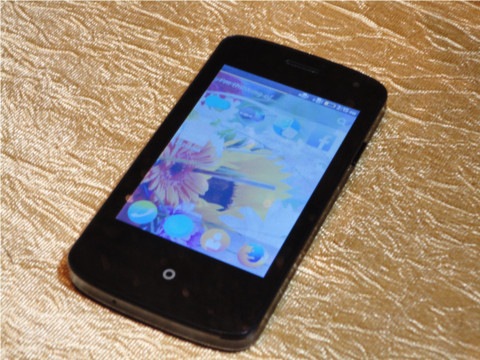
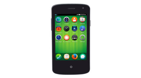
Spice Fire One Mi-FX 1 Firefox smartphone offers some extras for Rs 2,299


Spice Fire One Mi – FX 1
Powered by a 1 GHz processor, the Spice Fire One Mi – FX 1 has dual-SIM functionality with 2.5 G connectivity.
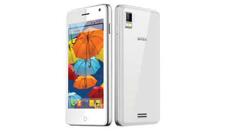
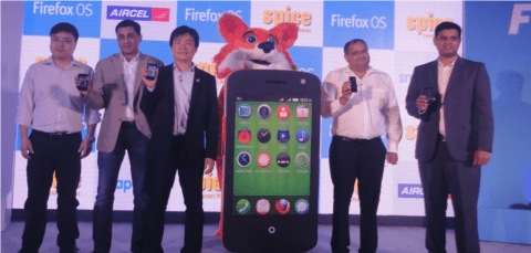
Spice on Friday showcased its Fire One Mi-FX 1 Firefox smartphone which was announced last week. Priced at Rs. 2,229, the Fire One Mi-FX 1 competes directly with the Intex Cloud FX FireFox smartphonewhich was launched on Monday at a price of Rs. 1,999. The Intex Cloud FX is the cheapest smartphone currently available in India.
Spice Fire One Mi-FX 1 Firefox smartphone
Justifying the higher price of Spice Fire One Mi-FX 1, the company’s CEO Prashant Bindal said, “The smartphone comes with a better battery along with a 1.3 MP rear camera with flash and front VGA camera. We are also offering a silicon cover for free.”
Spice Fire One Mi-FX 1 Firefox smartphone
The device is aimed at the masses that are looking for ward to use a cheap smartphone to make calls, messages, email, and stay connected on social media.
Spice Fire One Mi-FX 1 Firefox smartphone
The 2G Dual SIM enabled handset comes with a 1 GHz processor, 2.5 G connectivity, 8.89 cm HVGA capacitive touch screen, 1.3MP primary camera and 0.3 MP front camera. It packs a 1400 mAh battery. On the storage front, it has a memory slot that can be expanded up to 4 GB. Users will need a microSD card for multimedia tasks as there almost no internal memory.
Spice Fire One Mi-FX 1 Firefox smartphone
The Marketplace on this phone help users to download apps. This device also supports several Indian languages like Hindi, Tamil and Bangla and comes preloaded with Facebook, Twitter and Connect A2 instant messaging app. It is important to note that currently users will not find many popular Android apps on the Firefox marketplace.
Spice has also partnered with Aircel to give 1 GB of free data per month for three months.
Asked about Firefox’s plans to launch handsets in the mid-range segment, James Ho, senior director, Firefox Mobile Devices Group told Indianexpress.com: “Currently we are focusing on the ultra-low price smartphone market. We want to help feature phone users in India to upgrade to a smartphone. However, in the coming days, our handset partners are looking at bringing devices in every price segment in the country.”

Tuesday, August 12, 2014

When can I get an iPhone 6?

When can I get the iPhone 6?
History tells us that the new iPhone 6 will be released on September 9 (Picture: AFP/Getty)
The wait is over. We now know that there will be a big Apple event on September 9 2014.
Apple is holding a large press event where the iPhone 6 is almost certainly being introduced. While the secretive Apple will not yet disclose the details of the event, history tells us that the iPhone 6 will make its debut with iOS 8 available for immediate download.
Traditionally, Apple has released a new phone every year at almost exactly the same time. Many people have therefore concluded that this will in fact be the launch date and all the details regarding the iPhone 6 will finally be released.
If the launch date does turn out to be September 9, then it is looking increasingly likely that the phone will go on sale on the Friday of the following week, as this is the pattern that Apple has followed when launching previous models.
Most likely iPhone 6 preorder and sales dates
According to Aaron Basil, Lead Mobile Application Developer at Ethervision,
If Apple’s iPhone launch history serves as any indicator, then people can expect to preorder the iPhone 6 starting Friday September 12 with the first wave of devices arriving in home and ready for sale at all outlets by September 19.
Further weight is given to this conclusion by the fact that it is rumored that staff in Apple stores have been told that they are unable to book off any annual leave surrounding these dates.
Don’t forget about iOS 8
To create as much buzz on September 9, Apple will also most likely release iOS 8 to the masses. This is a perfect way to transfer the excitement into the hands of current iPhone users so they are salivating to get a new (and most likely bigger screened) iPhone 6.
When iOS 8 is released then there are likely to be a number of new features that have deliberately been kept hidden from the public and iOS developers in beta builds in order to give people something to look forward to. This is a good way for Apple to build huge amounts of anticipation.
Because Apple is unlikely to hold an event just to announce iOS 8, this further lends to the reality of 9/9/14 being the date the iPhone 6 is announced.

Microsoft launches low budget 'Nokia 130' for just NZD 30

Microsoft has launched a low budget phone 'Nokia 130', which can play music and videos but no internet capabilities, available for just 30NZ dollars.
The Nokia 130 comes in single and dual-SIM card varieties but does not have internet capabilities. Instead, it's optimized for playing music and videos.
The handset boasts up to 46 hours of music playback time and 16 hours of video playback. It can remain on standby without needing to charge for a month. Music and videos can be stored locally on the device with an SD card, and the phone itself can store up to 32 GB, Adweek reported.
The Nokia 130 also comes equipped with an FM radio, flashlight and 1.8-inch LCD display.
Microsoft understands the importance of hooking customers in developing markets, particularly Africa. Microsoft's Jo Har low said that Microsoft doesn't have any other project that can reach these consumers, the report said.


LG L60 could be coming soon, gets listed on official site

LG may be prepping the launch of the LG L60 smartphone. The device was recently spotted on its official site in Russia. It is likely to be a budget smartphone with a 4.3-inch WVGA display and would come with the latest Android 4.4 KitKat Operating System on board. Like other budget smartphones in the market this one too comes with entry level specs and features.
Other than a compact display and Android KitKat the LG L60 also has a 5-MP rear facing camera with LED flash and a front facing VGA resolution camera for photography and video calling respectively. The specs of this smartphone are similar to the LG L65 launched recently. This device will carry the legacy of L series of smartphone ahead with its Dual SIM feature on board.
It is powered by a 1.3GHz Dual-Core processor paired with 512MB of RAM and 4GB ROM. It allows memory expansion by up to 32GB using micro SD cards and has 3G on board for faster internet connections on the go. We speculate the device to come in India with a price tag not exceeding Rs 9,000. If so then this device will compete with other budget smartphones that come with MedaiTek processor on board.
Are you up for this device from LG? Or you were expecting a little more like the LG G3 smartphone? Let us know what you feel about this one.

Celkon Millennium Ultra Q500 coming soon with a budget price

Celkon, the Indian budget smartphone manufacturer, is planning to launch the Millennium Ultra Q500 smartphone this month. Celkon had earlier launched multiple budget friendly smartphones in India targeting all age categories. Now with Millennium Ultra Q500 the company is targeting KitKat lovers.
The latest Millennium Q500 from Celkon comes with Android KitKat OS on board and has a 5-inch HD display with a resolution of 1280x720 pixels. The display is based on One-Glass-Solution and has a Quad-Core processor (likely to be MediaTek SoC), there is 2GB RAM on board to handle multitasking efficiently and it has 16GB built-in storage.
The device will have a micro SD card slot for memory expansion and it will be priced around Rs 9,000 in India. Preorder for this device begins exclusively on Flipkart starting 14 August. Sales will begin on 24th August. This device will take the budget smartphone market with a storm. Recently Wickedleak launched a smartphone with similar specs but Octa-Core processor and priced it at Rs 8,490. The price war in India is likely to benefit customers. What do you think about this price war in India? Will it bring down the prices of popular brands too? Give us your thoughts on this.

Motorola Moto G2 specs leak ahead of official announcement

Motorola launched the Moto G smartphone and created a buzz globally. The device sold for a very attractive price and came down with every possible feature that was possible for that price and size. Moto G broke multiple records of sale in India and we already know that the company is working on Moto G2 smartphone. Although there is nothing hardcore known about the device but like its predecessor the G2 smartphone is likely to continue the legacy of low price and high end features.
The Motorola Moto G was launched in March in India. It was sold with an exclusive Flipkart partnership. Flipkart sold more than 1 lakh Moto G in India in a few months, so much so that every time new stock came in, the company would soon go out of stock. The phone continues to sell in India successfully and with a recent price cut of Rs 2,000 Moto G became even more attractive.
Now that companies are offering much better specs and features than Moto G for a price equal to it we expect Motorola to launch the G2 soon in India. A new leak about the Moto G2 has appeared on the internet which suggests that it will have a 720P display with 5-inch measurement. Other specs like 1.2Ghz Quad-Core Snapdragon 400, 1GB RAM, 8-MP rear and 2-MP front facing cameras have also been revealed.
Are you guys up for Motorola Moto G2 smartphone? Let us know what you think about this smartphone.

Intex launches Aqua Style Android 4.4.2 KitKat phone at Rs 5,99

intex aqua style cheap android kitkat phone
Supporting dual-SIM functionality, the smartphone comes with a 5 MP rear camera.
Intex Technologies has added another smartphone to its Aqua series, called Aqua Style. The phone runs on Android 4.4.2 KitKat operating system and is powered by 1.3 GHz quad-core processor along with 1 GB of RAM and 4 GB ROM. The smartphone comes with a 5 MP rear camera and offers shooting modes like panorama, HDR and continuous shot.
Supporting dual-SIM functionality, the phone supports Bluetooth 4.0 and WiFi. Available in two colors – white and black, the device is priced at Rs. 5,990. Intex is also offering a free flip cover with it. The phone is available at Intex retail stores, and leading e-commerce portals across India.

Samsung Galaxy Grand 2 gold version quietly shows up in India

The Samsung Galaxy Grand 2 has popped up in a brand new gold shade in India, giving buyers a new classy option to choose from. The fresh selection was quietly launched by the Korean giant and it’s currently listed on the eStore for the same Rs 20900 price, but is yet to go on sale.
There’s no word on whether the gold Samsung Galaxy Grand 2 will also be available through retail store or be exclusive to the company’s online shop. The new shade has been applied to the rear panel which flaunts a faux leather design. The plastic rim on the sides and the ring around the home button have also been treated to the hue.
Samsung Galaxy Grand 2
What’s disappointing here is that the shade used is rather dull and could have been more appealing if it were brighter. Nevertheless, something is better than nothing especially when you’re only options are the standard black and white. On a side note, the Grand 2 is also listed in pink, but is currently not in stock.
Also see: Samsung claims it’s still on top in India in reaction to ‘Micromax is No. 1′ claims
The smartphone is slightly larger than the Galaxy S5 flagship as it offers a 5.25-inch display and the panel used here is a 720p HD LCD. Android 4.3 Jelly Bean is offered out of the box along with various preloaded applications such as My Magazine, Multi Window, Club Samsung and more.
You can find the Samsung Galaxy Grand 2 key specs below:
- OS: Android 4.3 Jelly Bean
- Display: 5.25-inch 720p HD LCD
- Processor: 1.2GHz quad core
- Memory: 1.5GB RAM, 8GB storage, 64GB expandable
- Camera: 8MP rear, 1.9MP front
- Connectivity: HSPA+, Bluetooth 4.0, Wi-Fi a/b/g/n, GPS, dual SIM slots
- Battery: 2600mAh

Asus Zenfone 4 A400CG Review: Rounding Out the Family


Asus made quite a splash by launching three new phones this month, the Zenfone 4, Zenfone 5 and Zenfone 6. Despite the naming scheme, these are not the same device with different screen sizes. The sizes correspond to significant differences in price and capabilities.
Each of the three has its niche, and the Zenfone 4 is aimed squarely at capturing the bottom end of the smartphone market. Asus has its sights on first-time Android buyers who represent a massive opportunity for smartphone vendors.
There are two versions of the Zenfone 4 - the A400CG model which we have in for review today has a 4-inch screen and a 5-megapixel camera, whereas the A450CG, which hasn't launched here yet, has a 4.5-inch screen and 8-megapixel camera. Most other specifications are the same.
We were pretty impressed by the Zenfone 5 and Zenfone 6, which both provide excellent value at their price points. Now it's time to put the smallest sibling through our review process.

Look and feel
The Zenfone 4 is pretty small by today's standards, which means it's very easy to hold and use. It's very slightly shorter and wider than an iPhone 5, but quite a bit thicker. The bulging back in fact makes it more comfortable in the hand.
Our Zenfone 4 test unit came with a striking satiny blue rear panel, though black, white and red are also available. It's a high-quality finish, but we really wonder why Asus printed its own logo in red, right beneath the camera lens and speaker grille. There are also prominent white Intel Inside and Zenfone logos on the bottom rear.

The front is pretty consistent with the larger two Zenfones - there are three capacitive buttons below the screen and a speaker and camera above it. The lower lip and buttons have the distinct concentric circle texture that all Asus's Zen products have, but in this case it's all plastic and much less apparent.
The power and volume buttons are on the right edge, while the Micro-USB port is on the right and headset socket is on the top. There are two SIM card slots on the left edge, beneath the removable cover. The microSD card slot is to the left of the camera lens, right above the battery cavity. Unlike its bigger siblings, the Zenfone 4 has a removable battery.

Specifications and Software
With reduced prices come reduced specifications. The screen is a 4-inch 480x800-pixel panel which really isn't very bright and has poor viewing angles. The processor is a relatively low-end Intel Atom Z2520, which is a dual-core 1.2GHz model with Hyper-Threading and integrated PowerVR SGX544MP2 graphics. The 1GB of RAM and 8GB of internal storage space are both on the higher side for phones in this price range, and will help keep things fresh and snappy for a while. You also get Wi-Fi b/g/n, Bluetooth 4.0, A-GPS, an accelerometer and proximity sensor. The essentials are all accounted for, except maybe an ambient light sensor for automatic brightness control.
Asus ships the Zenfone 4 with Android 4.3, and there's quite a heavy skin on it called ZenUI. For the most part, we like Asus' work. The lock screen is clean and simple with all the required functionality - a big clock, weather information, notifications, alarm time, and shortcuts to the phone, messaging and camera apps. The shortcut icons also show the number of missed notifications, but strangely, you can't see who called or messaged.

You can have up to nine homescreens. Asus includes a widget called What's Next that shows upcoming appointments and important events. The app drawer has tabs which let you show only your downloaded or frequently used apps.
The notifications shade and quick settings panel are customised. They're both crisp and clear, which is all the more necessary on the Zenfone 4's low-resolution screen. You'll also see visual tweaks in the Settings, Messaging, Music, Email and other apps.

We weren't too happy with the default Asus keyboard - the layout is a bit odd with keys stacked perfectly in a grid rather than the more natural layout with each row offset - but there's no shortage of replacements in the Play store. Also, the decision to stick with capacitive buttons means you won't accidentally hit them while typing.
Asus includes a few interesting apps. SuperNote lets you create multi-page notes, on which you can type or sketch in multiple colours and styles. You can also embed photos, videos, audio clips, shape stamps and more. Do It Later is a reminders app that integrates with cloud services including Google and Exchange accounts. What's Next is the app counterpart of the homescreen widget of the same name.

The Splendid app lets you tweak screen parameters such as colour temperature and saturation. You can tweak each of the options by a few steps, but avoid the extremes (unless you want a monochrome screen, which is totally possible). The AudioWizard app only presents six audio EQ presets for different scenarios, including one for saving power. Share Link lets you easily set up a Wi-Fi Direct connection between two devices for file exchanges. Power Saver lets you define a custom profile or use a preset one to make the battery last longer.
Finally, there's the Kindle app, Movie Studio, Omlet Chat, Mirror, and of course assorted Google apps. Since most of the choices are actually quite useful, it doesn't feel like the Zenfone 4 comes with too much bloat.

Camera
Asus has packed quite a few filters and effects into its camera app. There are twelve modes to play with, including Time Rewind, Night, Selfie, Miniature, Smart Remove, All Smiles and GIF Animation. A Time Lapse mode is available when recording video. These work to varying degrees, but it takes quite a while to process some effects such as fake depth of field. There are also assorted filters which are applied before taking shots - Pencil, Cartoon, Lomo, Sepia, and more.
Party Link is a feature that uses Wi-Fi to sync photos between Asus phones as soon as they're taken. One person creates a group, and then others in the vicinity can join it. Other options you can adjust include image size, burst, anti-shake, face detection, auto focus mode, face detection, ISO, white balance and EV. It's a pretty broad range of capabilities for such an inexpensive device.

(Click to see full size)
Images measure only 2560x1440 (16:9) by default, but you can choose the larger 2560x1920 (4:3) if you prefer. Despite the low resolution, our test photos came out surprisingly sharp and clear. Other phones in this price range have fixed-focus lenses, but the Zenfone 4 has full autofocus and you can tap anywhere on the screen to change focus and metering. Close-up shots are far better than landscapes, but even so, the amount of detail in shots is remarkable. Even in low light, quality isn't bad at all - there's no flash, but we've seen far worse photos from phones which are twice as expensive or more. Even the front camera does an admirable job - another area in which budget phones typically don't do well at all.

(Click to see full size)
Video was also much better than we had expected. Full HD 1920x1080 clips look surprisingly good. They're definitely not crystal clear, but detail in things such as rustling leaves and curtains flapping in the wind is very good. These are videos that can be shown off and shared anywhere.

Performance
The Zenfone 4 might be cheap, but it's no slouch when it comes to performance. It managed to edge out the more expensive Motorola Moto E and Sony Xperia E1 Dual in pretty much every test. The score of 15,096 in AnTuTu was significantly better than the 12,546 and 13,200 points achieved by the Moto E and Xperia E1 respectively. Similarly, the Quadrant scores for all three phones were 6,395, 5,234 and 5,109 respectively.
Graphics scores were also higher - we recorded 16.4fps in GFXbench as opposed to 10.7 and 12.8 for the Moto E and Xperia E1 respectively. The three phones traded blows evenly in the more CPU-intensive SunSpider and Mozilla Kraken tests, though.
As far as subjective usage goes, we did find ourselves waiting for apps to load, but at least ZenUI transitions are quick and fluid. Basic games such as Temple Run were good enough - we wouldn't try anything heavier than that.

Battery life was also good, at 5 hours, 14 minutes in our video loop test. We would have liked to see a better score here, but it's at par with the competition. This should just about get you through a full day of calls, messages and a little bit of 3G Web usage. We had no complaints about call quality either, but were surprised to see an integrated option to record calls right in the phone app.
The built-in speaker is decently loud. Sound is thin, but it can get pretty loud and at least it doesn't distort. It came as a pleasant surprise that even our heaviest 1080p video sample played flawlessly on the Zenfone 4. However, as stated earlier, the phone's screen itself is pretty awful. We had to push the brightness up to its highest setting and even then, it wasn't always easy to see what was going on. Viewing angles are terrible and reflections on the glass make things that much worse.

Verdict
It seems that Asus is really on to something here - the Zenfone 4 is a fantastically capable device, considering its price. A lot of that has to do with the choice of an Intel processor - could the company finally be about to crack the mobile market, after struggling to do so for years?
The Zenfone 4's screen is pretty bad but nearly everything else is outstanding. We're particularly impressed with the device's camera capabilities. Full HD video recording is pretty neat, and it's nice to have a front camera - more so one that isn't terrible! We're looking forward to the A450CG revision which has a totally different screen and have high hopes that Asus will improve on this phone's one weakness.
It isn't hard at all to recommend the Zenfone 4. You can weigh your options between this phone, the Moto E and the Sony Xperia E1, but we think a lot of people who are shopping in this price range would be more than happy to save around Rs. 1,000-1,500.
10,000 ZenFone 5 units on sale exclusively via Flipkart today, says Asus

Following the footsteps of Xiaomi, Asus has announced that it will put 10,000 units of its ZenFone 5 smartphone on sale exclusively via Flipkart today. The Zenfone 5 is available in 8GB and 16GB versions, and the company hasn’t specified further break according to the storage space. Currently, the Flipkart page still shows the device is “out of stock” and it’s asking users to insert their email addresses to receive alerts about its availability.

The 8GB variant of the ZenFone 5 is priced at Rs 9,999, while the 16GB storage variant costs Rs 12,999.  The device was launched alongside a slew of other Zenfone models like the Zenfone 4, 4.5, and 6. Last month, the company had claimed to have sold 40,000 Zenfone units in a mere four days in India. 

Sitting in between the higher-end Zenfone 6 and low-end Zenfone 4, the dual-SIM Zenfone 5 sports a 5-inch screen.

It features a 1280 x 720 pixel IPS display, and comes with an 8MP rear camera.  There’s the standard 2MP camera for selfies and video calls. It runs on the same 2GHz Intel Atom dual-core processor as on the Zenfone 6, so it should be just as fast. It’s available in both 8GB and 16GB versions and you can add up to 64GB with a microSD card.

Video: Moto E vs. Moto G vs. Moto X

Who would have guessed that less than a year after Motorola gave us theMoto X, that we would have a whole family of “Moto” branded phones to compare. I sure didn’t picture it, yet that is exactly what we have. Thanks to last night’s unveiling of the Moto E, we now have three devices in total under the “Moto” name, the third being the previously announced Moto G. A fourth – the Moto 360 – will be here shortly.
Since we have three Moto devices, we decided to take a moment to compare them on camera. The differences here are subtle in some areas, then drastic in others. The Moto X, for example, has flagship features like Active Display and Touchless control, along with customizable options through MotoMaker. The Moto G and Moto E, on the other hand, have minimal software add-ons from Motorola and only swappable shells for customization. 
The specs also differ here and there (Moto E specs, Moto G specs, Moto X specs). The Moto X tops the list, as you would expect, even with its older processor. The Moto G and Moto E are actually quite comparable, minus a flash and front facing camera.
In the video below, we’ll talk about all of these differences, including price.


The Moto G was Motorola's biggest selling handset of all time. With the Moto E, it's going even cheaper – but is this a cut too far?

2013's Moto G was arguably one of the most significant handsets ever produced by Motorola, and that's saying something when you consider just how long the company has been making mobile handsets. It is apparently the firm's best-selling smartphone of all time, and attained that status by providing fantastically capable tech with excellent software at a bargain price.
Does the Moto E compete? Or is it just a cut too far? Join us for our full review of the Moto E.

Motorola Moto E Review: Design & Display

At first glance you would be forgiven for assuming the Moto G and Moto E are identical; they both share a minimalist design, with a largely plain front and a matte-touch back panel which is rounded neatly so that it sits perfectly in the palm of your hand. Motorola has been subtle when it comes to embellishing the phone, too. The iconic "M" logo resides on the rear of the handset, but aside from that, there's little else in the way of innocuous branding. 
Upon closer inspection it becomes clear that the Moto E lacks some of the physical refinements of its slightly more expensive sibling. The build quality remains excellent, but it feels a little less robust than the Moto G. It's slightly chubbier too, despite the fact that in length and width, it's actually a smaller handset. 
There are some neat touches, however: the silver strips above and below the screen, which double up as grilles for the earpiece and speaker, conspire to break-up an otherwise monolithic frontage. While the back panel of the Moto E can be removed – just as was the case with the Moto G – the battery contained inside is not removable. It does support MicroSD cards, however. 
The Moto E's screen is one of the most obvious areas where Motorola has cut back costs. Here we have a 4.3-inch 960 x 540 pixel display, which is a step backwards from the 4.5-inch 720p screen we were greeted with on the Moto G. As a result, you'll notice that it's possible to pick out individual pixels on certain images, text especially. On the whole, however, the difference probably isn't as pronounced as you might imagine. The lower resolution also means that the phone's slightly weak CPU doesn't have as much heavy lifting to do, which is a bonus. 
Despite its bargain basement price, Motorola has ensured that the Moto E can withstand the usual everyday punishments we put our tech through. The screen is constructed of Corning Gorilla Glass 3, which is a super-tough material designed to withstand marks and scratches, as well as prevent unsightly smudging. We're happy to report that it performs its role admirably; compared to our Nexus 5, which has a screen that attracts greasy fingerprints with worrying regularity, the Moto E's display managed to remain almost entirely smudge-free during the review period.
The bodywork of the phone is also splash proof, which means you don't have to be too concerned about getting it wet when you're running for the bus on a rainy Monday morning. However, it doesn't offer the same protection as truly water-resistant phones, like the Galaxy S5 and LG G3, so don’t go getting in the shower or bath with it.

Motorola Moto E review: Software & User Experience 

One of the most appealing elements of the Moto G was the fact that it used stock Android, with only a smattering of exclusive apps to set it apart from the likes of the Nexus 4 and Nexus 5. Stock Android is generally faster and slicker than the UIs produced by the likes of Samsung and HTC, and this is because it hasn't been tinkered with in any way –– it's a "pure" version of Google's OS
Motorola has wisely maintained this stance with the Moto E, which is running Android 4.4.2 and will be getting an upgrade to the next version, Android L, once it becomes available later this year.

Motorola Moto E Review: Hardware & CPU

The Moto E is packing a 1.2GHz dual-core Snapdragon 200 processor backed by 1GB of RAM, and an Adreno 302 graphics processor. If that doesn't mean anything to you then take it from us, this isn't a cutting-edge handset. Even so, the overall performance isn't to be sniffed at. The Moto E may not offer the silky-smooth feel of the Nexus 5 or Galaxy S5, but it's still more than adequate for most users and not a million miles away from the experience provided by the Moto G, which is running a more powerful set of internal specifications.
Benchmark tests prove what we already know; the tech inside the Moto E isn't going to win any awards when set against the very best that Android has to offer. Running AnTuTu delivers a score of 12647, putting the Moto E well behind the likes of the HTC One M8, Samsung Galaxy S5 and LG G2. 
On Geekbench 3, the phone scores a 594 multi-core score, and a 322 single-core score – again, well below cutting-edge. Such figures sound damning on paper, but in reality the gulf isn't as pronounced as you might expect. 3D games naturally don't run as quickly or as smoothly, but every day usage is perfectly fine.

Motorola Moto E Review: Battery & Memory 

The Moto E comes with a 1920mAh battery, which can clearly be seen when you remove the back panel, but sadly cannot be accessed or removed. Motorola boasts that the phone is capable of lasting an entire day, and during our review this claim seemed to hold water.
We managed to get past that all-important 24-hour marker before a trip to the nearest wall socket was needed, but when we adopted a more aggressive usage pattern the stamina dropped massively. The Moto E may have a more modest CPU, but the fact that it's one of the older Snapdragon processors means that it's also not as economical with the juice and, therefore, won't last as long as its more expensive stable mate.
The Moto E comes with just 4GB of internal storage, of which you only have access to just over half – 2.16GB, to be precise. Needless to say, this fills up pretty quickly, so you'll want to invest in a Micro SD card as soon as possible. However, due to essential security changes in KitKat, external memory isn't the wild and free place it used to be on Android. Apps can only interact with folders they have created themselves on the SD card, so while you can create folders and add content using your PC, your apps won't be able to make changes within those folders due to Android's newfound security.
Translation: if you use a lot of apps you’re probably best of looking at a phone with more internal storage – 16GB and up-levels of storage, to be precise.

Motorola Moto E Review: Camera 

This is possibly the weakest point of the entire phone. The Moto E features a 5MP camera, but it's a fixed focus lens so you can't take close-up shots. There's also no LED flash.
While the auto HDR function does a good job of improving image quality, the overall performance of the Moto E's camera is rather poor when compared to most other Android phones. 
The fact that it's only when you use the Moto E as a photographic device that you're reminded of its low-cost origins says a lot about the general quality of this blower, but that doesn't make it any less disappointing. Photos are increasingly becoming a major part of our mobile experience thanks to apps like Facebook, Twitter and Instagram, and there's a good chance that you'll be too embarrassed to come along to the party when you're armed with such a lacklustre snapper.
It's also worth noting that the Moto E lacks a front-facing camera, so you can't use the phone for Skype calls or any of that kind of jazz.

Motorola Moto E Review: Conclusion 

The Moto G completely redefined the concept of the budget smartphone, providing an experience that most people would have happily paid twice or maybe three times as much for. The Moto E is even cheaper, but in order to shave some cash off the RRP, Motorola has had to cut corners when it comes to screen size, CPU power and camera capability. 
Despite this, the Moto E remains an impressive phone that puts rival low-cost smartphones well and truly in the shade. If you're in the market for a device and price is your primary concern, then it makes sense to save the additional pennies and pick this over the Moto G, but if you can stretch the cost then Motorola's 2013 offering is a cannier purchase. .

The Xiaomi Mi 3 ordeal: Why the Flipkart exclusive strategy is not working

Last month, everyone was excited about Xiaomi. A look at the Mi 3 specs and price, and you wouldn’t doubt the frenzy either. The company decided to go the Motorola way and opted for the online distribution model with an exclusive tie-up with Flipkart, rather than setting up a local sales base or its own online retail channel. However, that arrangement hasn’t quite worked as expected. That’s down to the lack of information about availability, Flipkart’s troubles in dealing with heavy traffic and the new registration process that hasn’t gone down well with several shoppers.

The Xiaomi Mi 3 went on sale on July 22, and the company had claimed to receive around 1,00,000 registrations by July 21 itself. Only registered users could buy the device the next day. However, pre-registration didn’t guarantee you a unit, and it only meant you were eligible to buy the phone. As soon as the Mi 3 went live on the site, Flipkart couldn’t handle the traffic and the site crashed temporarily. Within 40 minutes, Flipkart claimed the Mi 3 was out of stock, but the site promptly said it would bring in the next batch on July 29 while the registration would begin on July 28. And to top it all, the second batch apparently sold in five seconds.


Its third batch sold out at a record less than two seconds. Two seconds may sound unbelievable? This was possible as Flipkart had changed the process for the second batch wherein users simply needed to add the device to their carts, and could make the payment any time later that day.  All the hype has generated one simple question: How many Mi 3 units have been sold so far?

An earlier report by BGR claimed the number to be around 20,000, while Zauba and import-export tracking site, shows that only 10,400 units of Mi 3 units were brought to India on July 25. If these details are to be believed than Flipkart may have put up approximately 10,000 units on sale each of the previous two times. It then put up 15,000 units on sale, and today’s flash sal will see 20,000 units go up on sale. And when it is back in stock next week (which we suspect it will), then we could be in for a re-run of the out-of-stock drama next week too, when the Mi 3 will be back on sale.

It would also be safe to assume that Xiaomi was gauging the response to the relatively new Chinese brand in India and has been cautious about the number of units it has shipped to the country. In that case, the question many are asking is why did the company allow up to one lakh registrations if it had just 10,000 units. It wouldn’t have been able to meet the tenfold demand, anyway. It should also be noted that Flipkart claimed to have around 250,000 potential buyers on the Mi 3 page when the second batch went on sale. So the demand was several times the meagre number of units available, if the actual sales figures are true.