The HTC One M9+ is the estranged big brother of the One M9
 that grew up in Asia and learned a few new tricks. It is literally bigger, thanks to its 5.2-inch Quad HD display, has a fingerprint sensor, a MediaTek helio X10 processor, and even brings back the Duo Camera sensor from the M8
 .
.

The M9+ is only available in select Asian markets where the standard M9 isn’t available, and will be coming to certain parts of Europe later this year. If you were thinking of picking this up over the standard M9 or just stuck with this one option in your region, read on to find out more.
Design
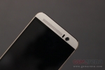
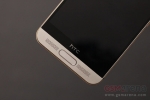
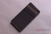
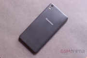
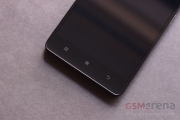
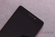
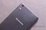
The design of the M9+ is fairly similar to the M9 but with a few notable differences. The main one is the fingerprint sensor on the front, which looks shoehorned between the right stereo speaker (left grille) and the microphone (right grille). Also, on the back is the distinctive Duo Camera making a comeback with its additional depth sensor on top, and the main 21 megapixel camera lens cover is now circular to match the depth sensor.
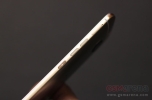
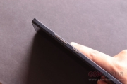
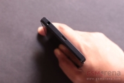
The rest of the design is identical to the One M9. The front of the phone has those same sizable bezels, especially below the display that makes the phone too tall and hard to use with one hand. On the side are the new sharpened edges that seem too sharp at first but actually help grip the phone unlike the slippery smooth edges on the M8. The right side has the volume control buttons and the power button. The volume control buttons are split into two and the exact same size and shape as the power button, which means it’s not hard to press the wrong button at times. There is also the microSD tray on the right, with the nano SIM card tray being on the left of the phone. On the top is the IR sensor and on the bottom the headphone jack and the typical HTC upside down microUSB port.
Just like the M9, the M9+ comes in two tone color option. The phone you see above had a silver finish on the front and back and gold on the sides. If you don’t fancy the two tone option, you can get it in full gray or full silver. Regardless of the color, the front of the phone has a matte finish while the sides and the back have a brushed finish.
Just like with the M9, and the M8 and M7 before it, the build quality and fit and finish of the M9+ is exemplary. The phone feels built like a rock and almost as heavy as one. It’s not excessively heavy but it might put some people off. The height does make the phone a bit hard to operate with one hand, even though the phone itself isn’t particularly wide.
Display
The One M9+ has a 5.2-inch, 2560 x 1440 resolution IPS LCD. The display is, quite simply, one of the best on the market, with incredible sharpness, beautiful colors, high brightness, and perfect viewing angles. The colors are vivid without being oversaturated and the overall calibration seems close to ideal to the eye. There really are no discernible issues with the display; it’s pretty close to perfect.
Hardware and Software
Unlike the M9, which runs on the Qualcomm Snapdragon 810, the M9+ runs on the 64-bit MediaTek helio X10 MT6795 SoC, with octa-core Cortex-A53 CPU clocked at 2.2GHz and PowerVR G6200 GPU. There’s also 3GB of RAM and 32GB of internal memory, with about 22GB available to the user. You can expand it up to an additional 2TB with microSD cards. The phone also supports USB OTG devices. In terms of connectivity, the phone supports LTE, Wi-Fi 802.11ac, Bluetooth 4.1, GPS, GLONASS, Beidou, and NFC.
On the software side, the One M9+ has Sense 7.0 running on top of Android 5.0.2 Lollipop. The UI looks similar to that on the previous version of Sense on the One M8 but there are enough minor UI changes everywhere to make it look fresh. Most importantly, it now has support for themes, so you can tweak the look even further. What’s problematic is that there is no coherence between HTC’s and Google’s design languages. Sense 7.0 looks pretty much nothing like Material Design, which is why it’s jarring to see a popup for something or the other using Material Design every time it appears on screen.
Performance
The MediaTek chipset on the M9+ is quite powerful and makes light work of most applications. Opening and closing apps, scrolling, and multitasking are all accomplished with a fair amount of ease. Gaming performance is acceptable but you can tell the chipset is not powerful enough to run heavy 3D games at QHD resolution perfectly fine, although most casual games run with no issues whatsoever.
The multimedia performance is good, too. The phone supports most audio/video codecs out of the box. The display is great for watching videos. HTC”s BoomSound speakers aren’t honestly as loud as some people hype them to be but have a richer, more full bodied sound than most phone loudspeakers, and the positioning around the screen helps in creating proper stereo imaging. HTC has also added Dolby surround sound effect, which can be toggled by changing the BoomSound setting from the standard Music mode to Theater, which results in a wider soundstage. You get a more simpler sound enhancement effect with headphones but there’s no need for it as the phone sounds perfectly fine without it and thanks to the built-in headphone amp has one of the loudest outputs around. HTC also provides some great in-ear earphones in the packaging.
The M9+ unfortunately suffers from an overheating problem. In normal usage the phone maintains normal room temperature but fire up a game and the phone gradually reaches an uncomfortable temperature, which spreads easily thanks to the aluminum body. It never gets unbearably hot, even at max display brightness, but it’s still fairly warm and not particularly pleasant to touch.
Fingerprint sensor
The major addition with the M9+ is the fingerprint sensor. Contrary to what you might first think, the sensor is not placed over a physical button, that is, it does not move. Having said that, you can enable an option in the settings that will allow you to tap on the sensor to go to the homescreen, effectively turning into a second Home button that you don’t really need.
What’s cool though about this sensor is that you can place your finger on it even when the display is off and the phone will wake up and then unlock itself, without having to press any of the buttons first as on the iPhone or the Galaxy S6. This makes the unlocking process a bit quicker and easier. This does mean the phone will occasionally wake up or unlock when you’re holding the phone in your hand if your finger touches the sensor, which is why you can disable this feature.
Adding prints to the phone is identical to the way it is on the iPhone or the S6, and you can add up to 5 prints. Other than unlocking the phone, there is nothing else you can do with the sensor as of now but with native support coming in Android M this sensor is going to become a whole lot more useful and a genuine advantage over the standard One M9. Even without that, it’s still far more convenient and faster to simply use the sensor over a pin or pattern lock and infinitely more secure than having no screen lock.
Camera
The One M9+ has the same 21 megapixel Toshiba sensor as the One M9, with the addition of the depth sensor. The image quality of the rear camera is mediocre. The daylight images look good, although detail level is nowhere as good as what 21 megapixels might suggest. The colors are decent but the images are a bit on the warm side. There is also some noise, which is normally hidden but comes out when you start editing the image. In low-light, though, all hell breaks loose. The amount of noise becomes unbearable and is clearly noticeable in indoor shots. You have to try real hard with a dozen filters just to hide the noise in your pictures.
The video recording isn’t great, either. The crop is too tight at 4K since it uses the center portion of the sensor at 1:1 instead of using the entire sensor with pixel binning the way Samsung does. This means all the problems of the still photos are present in the videos, except now slightly worse. The 4K videos don’t even look that great when seen on a 1080p computer monitor.
What makes it worse for both images and videos is the lack of OIS. Low light images often turn out blurry unless you manually stabilize the phone and videos also have a lot of shake in them.
As for the front camera, it’s the same 4 UltraPixel camera from the M9 and the back of the M8. It’s one of the better front facing cameras out there, which is not really saying much.
Lastly, the Duo Camera feature is about as useless this time as it was the last time. It requires you to be at least a foot away from the subject else it won’t work, which, in case of small subjects like flowers, makes them look even smaller. The system still struggles with separating the foreground subject from a busy background subject and the artificial blurring of background still looks iffy. Overall, a complete waste of a feature that should have been dropped on the M9+ as well.
The only good thing about the camera experience is the camera app, which is well laid out and has all the necessary options that make you wish it had a better camera hardware to go with it.
Battery Life
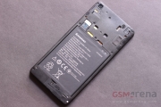
The M9+ has the same 2840mAh non-removable battery as the M9. There is no nice way of saying this but the battery life on the M9+ is atrocious to the point where it seems like a bug. The rate at which the battery meter drops while using the phone is almost hilarious and you could kill the phone from a full charge in about 5-6 hours if you tried. With normal use the phone can last around 8 hours, which again isn’t a lot. The battery drain only happens while using the phone, as it can hold on to a charge quite well in sleep (so you know it’s not Google Play Services that’s killing the battery). Hopefully, this is a bug and there is some solution to the drastic drain in future software updates.
Overall
The One M9+ is a premium phone, even more so than the M9 as the name implies, and it’s priced accordingly. In India, for example, the phone is officially priced at Rs. 52,500 ($827), although you can buy it for around Rs. 48,999 ($772). That puts it well above even the Galaxy S6 , which does a lot of things equally well, and some things, such as the camera, a lot better. This puts the One M9+ in a tough spot. There’s a lot to like about it, such as the design, the build quality, the display, the audio quality, and the UI performance. But the mediocre camera, poor battery life, slight heating issue, and the high price makes it hard to recommend to anyone.


